Rows: 1222 Columns: 10
── Column specification ────────────────────────────────────────────────────────
Delimiter: ","
chr (2): months, state
dbl (8): year, colony_n, colony_max, colony_lost, colony_lost_pct, colony_ad...

ℹ Use `spec()` to retrieve the full column specification for this data.
ℹ Specify the column types or set `show_col_types = FALSE` to quiet this message.
This is an analysis of the Bee Colony data set. The bee colony data set provides information on honey bee colonies across the United States with regards to the number of colonies, maximum, lost, percent lost, added, renovated, and percent renovated. In this technical report I aim to answer the following questions: during which months did we lose the most bee colonies? During which years did we lose the most bee colonies? Is there a state that seems superior to the others in terms of honey bee colony size? Is there a state that seems to lose more honey bee colonies than others?
This data set spans several years during which the number of bee colony losses per state were observed and recorded. Using RStudio we were able to create box plots, allowing for better visualization and analysis of the data when focusing on correlation between months/year or state and bee colony losses observed. Using RStudio I was able to deduce from the graphs and tables created that the most bee colonies were lost during October-December.
Interesting Questions
During which months did we lose the most bee colonies? The least?
During which years did we lose the most bee colonies? The least?
Is there a state that seems superior to the others in terms of colony size?
Is there a state that seems to lose more bee colonies than others?
Hypotheses
I hypothesize that the most bee colonies were lost throughout October-December and the least bee colonies were lost throughout April-June.
I hypothesize that the most bee colonies were lost during 2015 and the least bee colonies were lost during 2017.
I hypothesize that California is the largest in size and has the most bee colonies.
I hypothesize that Florida lost the most bee colonies during the years this data was collected.
training_data %>%skim()
Data summary
Name
Piped data
Number of rows
611
Number of columns
10
_______________________
Column type frequency:
character
2
numeric
8
________________________
Group variables
None
Variable type: character
skim_variable
n_missing
complete_rate
min
max
empty
n_unique
whitespace
months
0
1
10
16
0
4
0
state
0
1
4
14
0
47
0
Variable type: numeric
skim_variable
n_missing
complete_rate
mean
sd
p0
p25
p50
p75
p100
hist
year
0
1.00
2017.81
1.81
2015
2016.00
2018
2019
2021
▇▅▅▅▆
colony_n
27
0.96
110319.64
400326.11
1300
8000.00
17000
53000
3181180
▇▁▁▁▁
colony_max
37
0.94
75456.31
168999.94
1700
9000.00
21000
65000
1400000
▇▁▁▁▁
colony_lost
27
0.96
14750.45
54305.79
20
930.00
2100
6500
500020
▇▁▁▁▁
colony_lost_pct
31
0.95
11.35
7.15
1
6.75
10
15
52
▇▅▁▁▁
colony_added
45
0.93
15586.61
62574.11
10
402.50
1900
6000
736920
▇▁▁▁▁
colony_reno
70
0.89
13940.24
56907.24
10
270.00
930
4570
692850
▇▁▁▁▁
colony_reno_pct
130
0.79
9.33
10.57
1
3.00
6
13
77
▇▁▁▁▁
Introduction
This report provides information on honey bee colonies in the US regarding the number of colonies, maximum, lost, percent lost, added, renovated, and percent renovated. Colony loss rates are calculated as the ratio of the number of colonies lost to the number of colonies managed over a defined period. Colony loss rates are best interpreted as a turn-over rate, as high levels of losses do not necessarily result in a decrease in the total number of colonies managed in the United States. I hypothesized that the most bee colonies were lost October-December and the least number of bee colonies were lost April-June. It was also hypothesized that the most bee colonies were lost during 2015 and the least bee colonies were lost during 2017, when focusing on year.
Exploratory Data
I decided to only use data pertaining to the state of Florida, so I could get a general idea of the average values for bee colonies in this state. I chose Florida because while skimming the data it looked like it was higher (numerically) when comparing it to the other states. Once I was able to isolate the data from the state of Florida, it became obvious that the average percent of colonies lost (14%) was greater than the original average percent of colonies lost (11%) when creating our exploratory data.
This table allows me to look at data specific to the state of Florida. This table tells me that Florida has a mean value of 14% for percent of average colony lost. This is a slight increase from the first table created at the beginning of the report, which gave a value of 11% for the average percent of honey bee colonies lost. Seeing how both values are precise makes me more confident of this data.
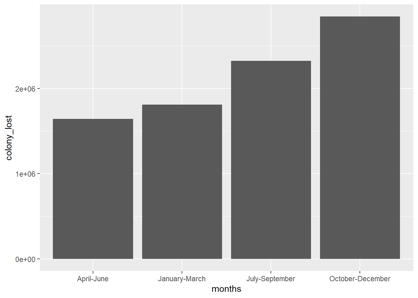
Next, I decided to look during which months the greatest number of honey bee colonies were lost to see if there was a possible correlation between the time of year (months) and amount of colony lost. I originally used a bar graph to display this data, but quickly discovered a box plot would do a much better job of displaying the data, which I then created immediately following this graph.
This graph made me realize that a bar graph was not the best format to use when displaying my data. Although the data could be organized in a better way, this graph told me that the most (top 4) bee colonies were lost: April-June, January-March, July-September, and October-December. If we were actually to look closer, however, we see that the most bee colonies were lost October-December.
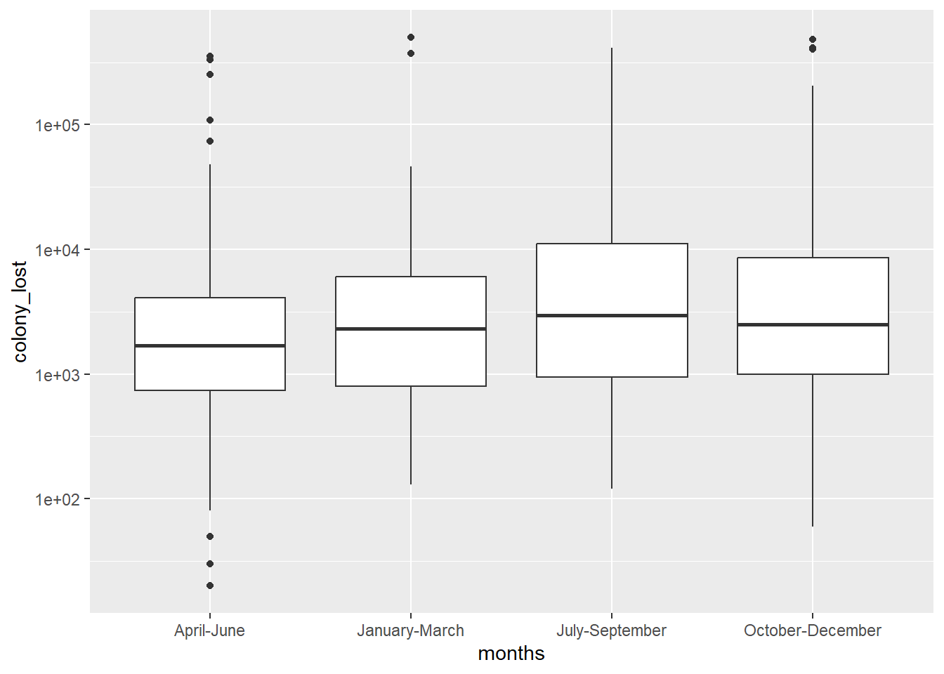
I decided to create a box plot with my months and colony lost data once again to create a graph that would hopefully allow me to understand the results better. Looking at the graph we see that that data is organized in a much more visually pleasing manner that allows for better analysis. Similar to the bar graph, this graph shows the top four time periods where the greatest number of bee colonies were lost.
This graph, especially when the scale_y_log10() was added to the code, displayed the data in a more visually appealing way. Not only were we able to look at the box-plot and see that the most bee colonies were lost October-December, but we also learned that the amount of bee colonies lost were very numerically close between the different months of time. This makes me a little wary of the data because it makes me question how accurate the data is, I would have assumed there to be a more drastic difference between the months (more specifically Winter and Spring/Fall/Summer).
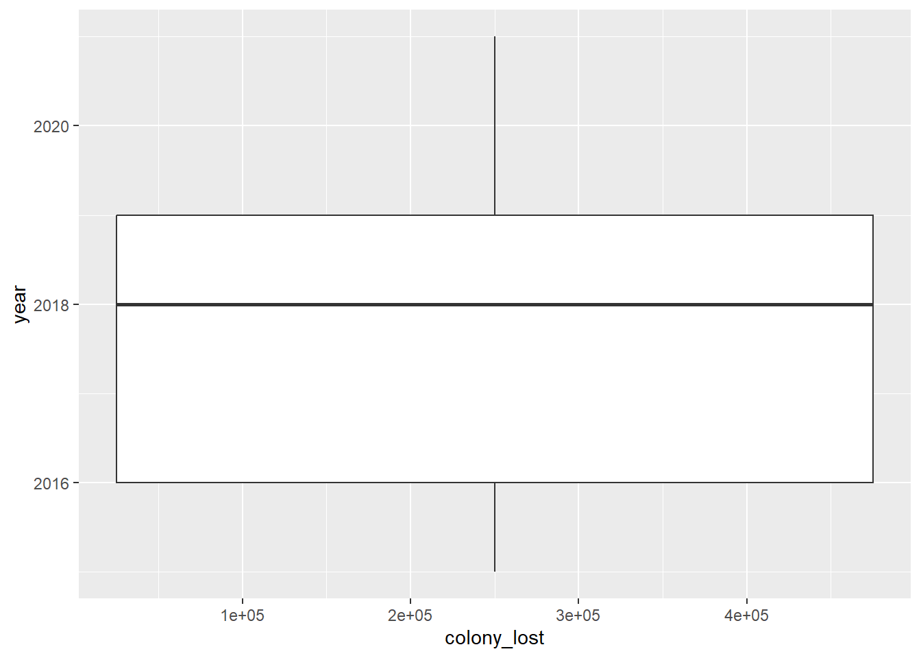
Next I went ahead and created another box plot, but this time focusing on the year and colony lost. I wanted to see if there was a correlation between the year and colony lost. I also wanted to see if it was there were any similarities between months and colony lost and years and colony lost. The first graph was not successful in that it only plotted the data for the year 2018 so I was really unable to gather much information from this box-plot.
This box-plot was my first attempt at looking at the (possible) correlation between the amount of honey bee colonies lost and the year. I was curious to see if there was a year where honey bees were more greatly affected. Unfortunately, this graph is only recognizing the year 2018.
After going back and looking over my data I decided to try and make a plot graph to better display my data, but this time I was going to focus on colony lost and colony added. I decided to focus on a different aspect within my data because I had not been so successful focusing on time (months/years) and colony lost. Below you can see that the graph actually ended up coming out really nicely and was a lot easier visually to digest.
This graph shows the correlation between the amount of honey bee colonies lost and amount of honey bees colonies added. A line of best fit was created to better analyze and understand the data. Looking at the line of best fit we see that the lower numbers appear more accurate compared to the higher data sets where there are far less data points and more outliers present.
Conclusion
Using RStudio I was able to answer my original questions regarding the Honey Bee Colony Data Set. For starters, it was concluded that the most bee colonies were lost during October-December. However, RStudio gave us the top four periods of time (months) that lost the most bee colonies and all were suspiciously close numerically. More data should be acquired on the possible (human) error that occurred while collecting this data set. Second, by creating a plot graph, we were able to deduce that there is a correlation between the amount of honey bee colonies added and the amount of colony lost. Once the line of best fit was added, it was clear that more graphs would help us better understand what we were seeing (a grouping of low numerical values and then some higher numerical values that strayed much further from the line of best fit). This report was an initial attempt to understand how RStudio works and its ability to organize biological data. Moving forward, more data pertaining to our primary questions should be gathered and more detailed graphs created.